Design Process - Typographic Composition Zine
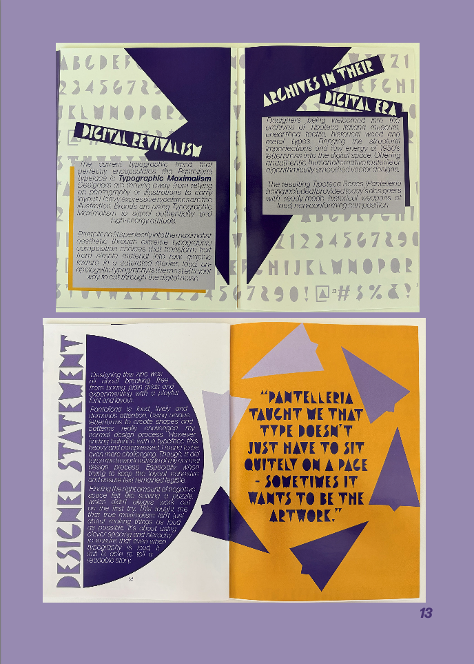
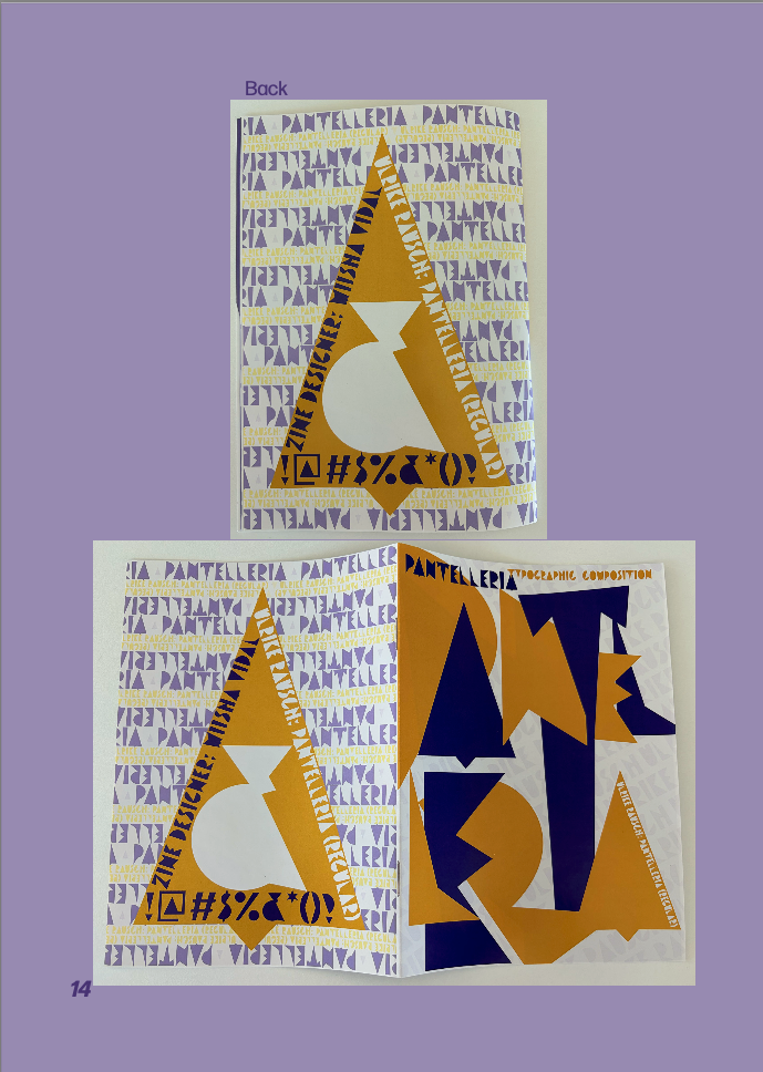
Creating my Typography Composition Zine, has reframed my future approach to typographic layouts.
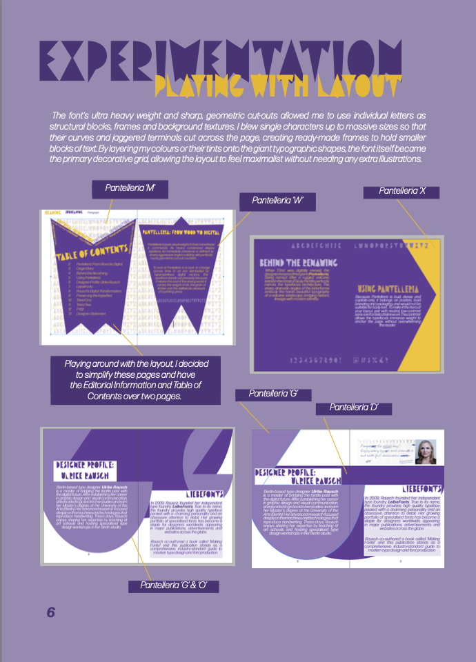
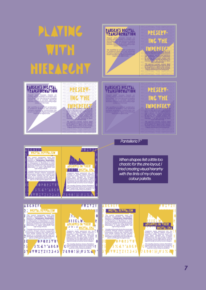
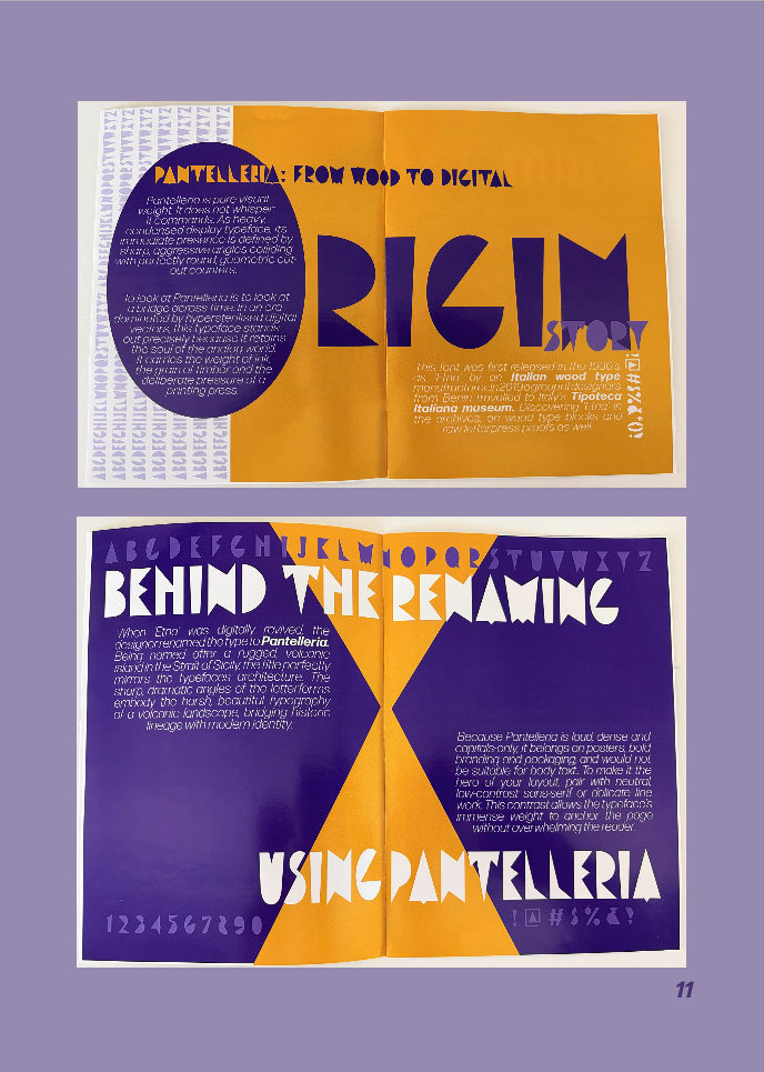
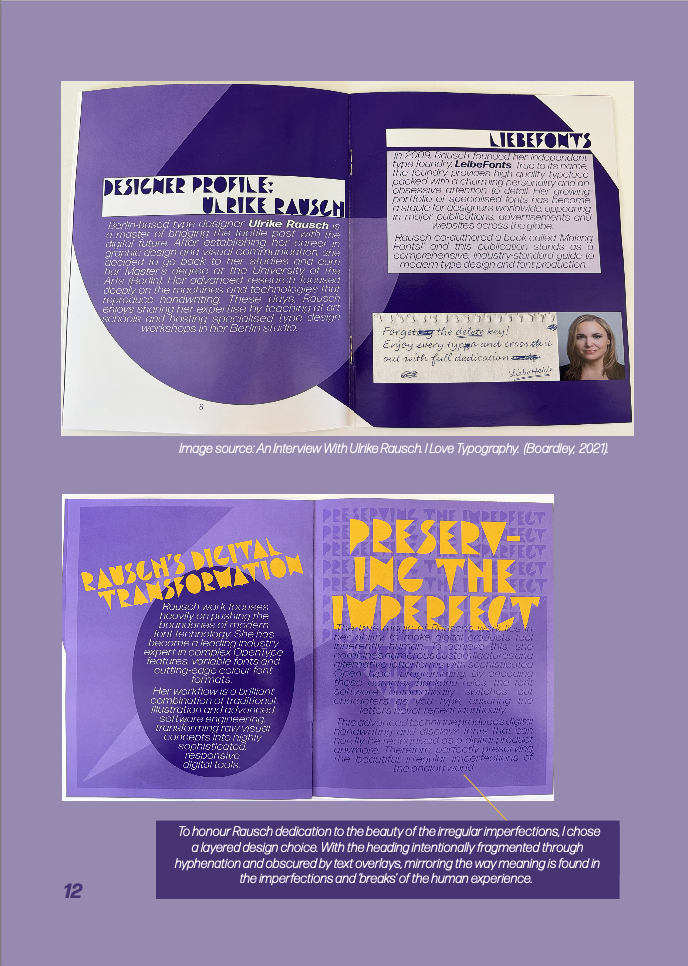
Next time I work with a dominating, expressive display face, I will treat negative space almost like a puzzle and be mindful of this in my sketching. Rather than trying to solve this later in the digital studio. I will plan my breathing room around the letters, ensuring there is space for the reader’s eye to rest. In future, I will embrace Brownie’s (2020) views on the plasticity of type by treating letter forms as flexible graphic shapes that can be layered or bled off the canvas without losing their meaning. This process taught me to stay adaptable when a layout feels too claustrophobic rather than sticking to a rigid initial plan. This experience taught me that true maximalism isn’t just about cranking up the volume, it is about using clever spacing, sharp colour hierarchy and a flexible mind to let a font tell its own story.
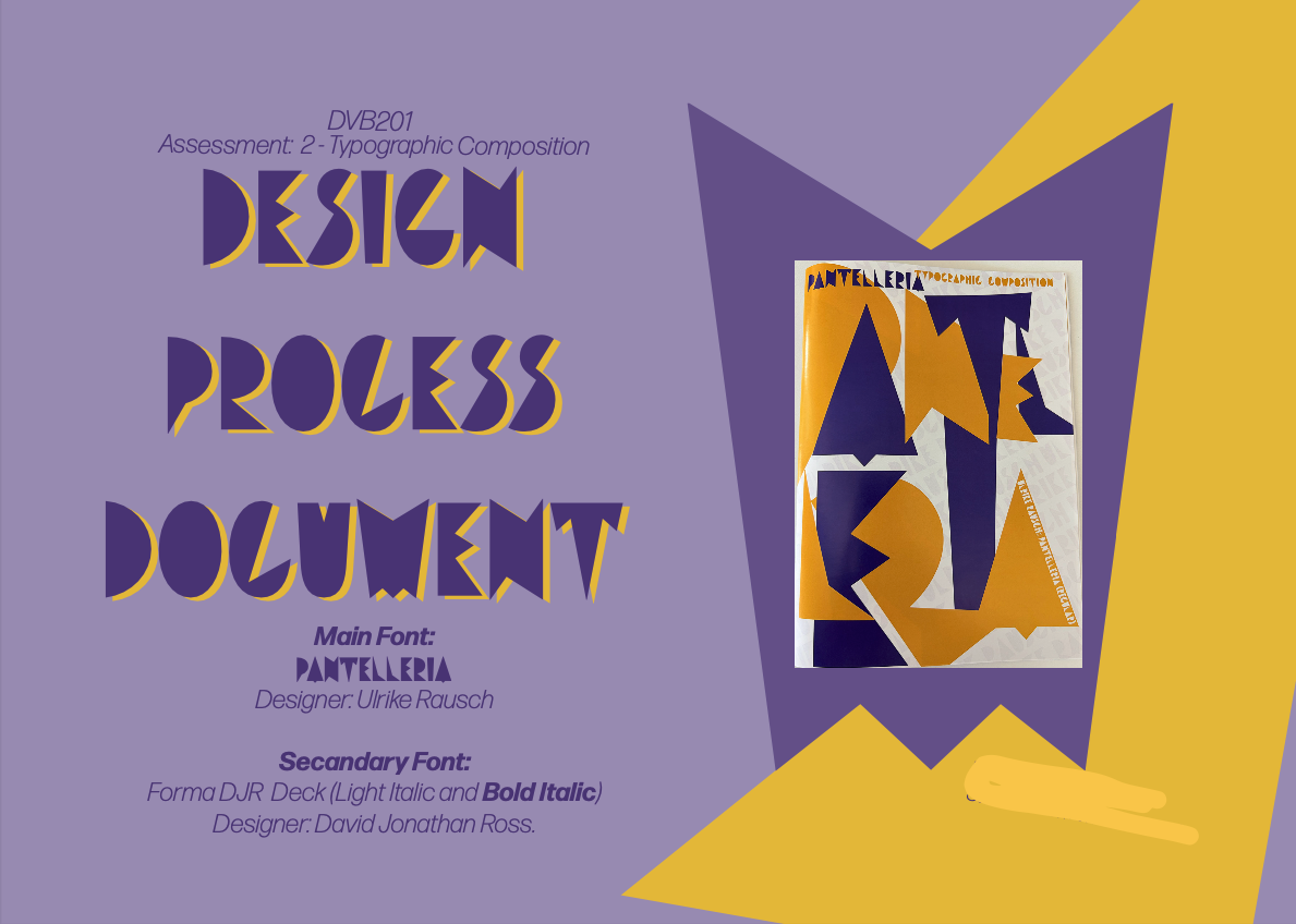
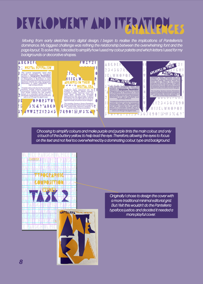
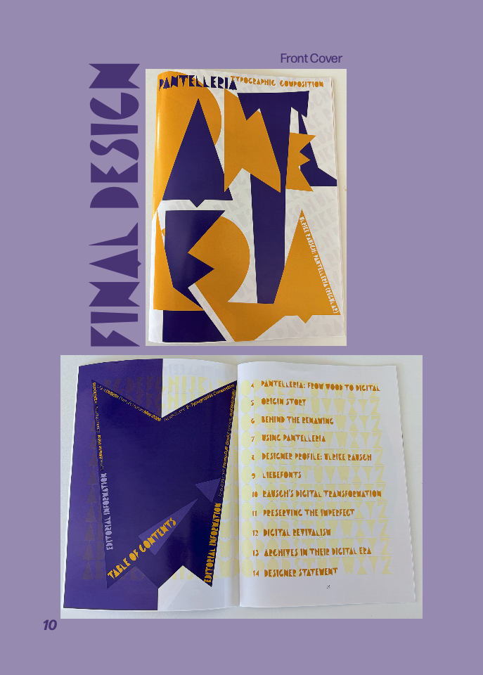
In summary, I feel more confident using typography as a structural graphic shape and successfully using both shape and colour to establish hierarchy within a chaotic, maximalist layout. While I enjoyed the creative freedom of treating bold, playful Pantelleria font as a decorative illustration, managing the heavy, compressed weight made finding pockets of negative space an initial frustration. Ultimately, this learning curve proved that good design isn’t about hiding behind safe, plain grids, it is about learning how to beautifully control the noise.