River City Ramen - Experimental Font Design
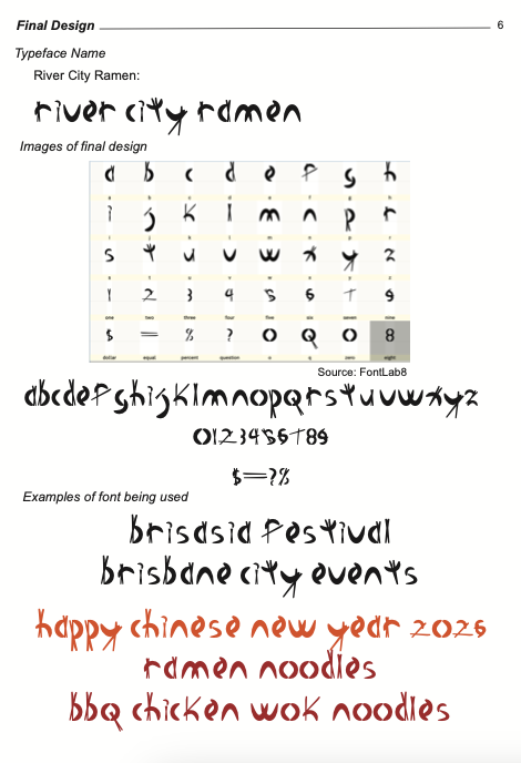
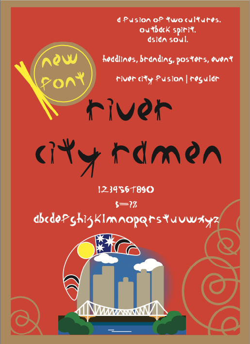
The conceptual foundation of ‘River City Ramen,’ was to align with the design brief and chosen event, BrisAsia Festival. My design journey focused on translating the ‘energy and force’ of this specific festival into a functional typeface, that showcases both Australian/First Nations heritage and the Asian-fusion culinary heart of the BrisAsia Festival. In a city evolving in the lead-up to the 2032 Olympics, the font serves as a visual bridge between local tradition and a dynamic, global future.
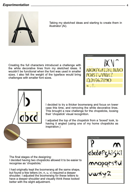
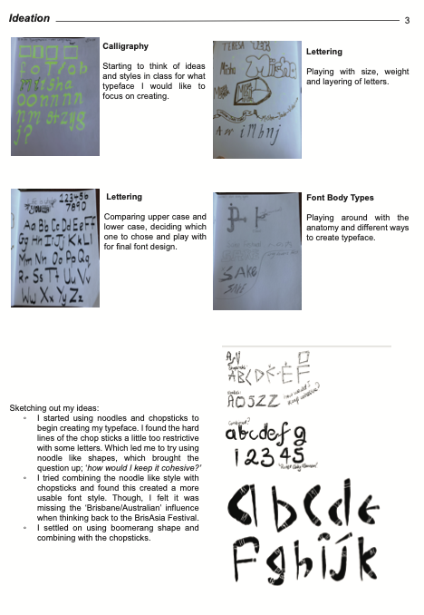
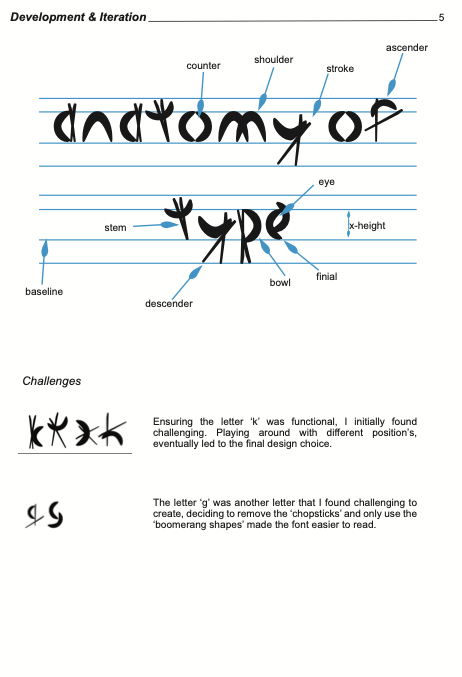
To achieve this, I utilised two distinct symbolic forms, the boomerang and the chopsticks. The boomerang, representing the First Nations enduring connection to the land and the literal, winding path of the Brisbane River, serves as the primary structural element for the strokes, ascenders and bowls. The linear, sharp geometry of the chopstick, forms the strokes, stems and descenders. This duality reflects the cultural fusion that defines the BrisAsia Festival, creating a narrative of harmony through contrast.